A nice feauture in CSS3 is the box-shadow. Instead of working with tedious PNG-images you can add shadows to any element with the CSS property box-shadow.
The syntax works like this:
box-shadow: <offset-x> <offset-y> <blur> <spread> <color> <inset>
- The offset settings will set the angle of the shadow. Where it will be cast in relation to the element.
- Blur with set how much the shadows blurs out from its defined position.
- Spread will set the size of the shadow. By default the same size as the element. This number can be negative to set a smaller shadow.
- Color can be any format. i.e. black, yellow, #FFF, rgb(255, 240, 240) or rgba(0, 0, 0, 0.7)
- Using the inset option will cast the shadow inside the element instead of outside.
Here are some examples:
box-shadow: 10px 5px #000;
Shadow is offset 10px to the right, 5px down and have the color #000 (black)

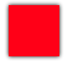
box-shadow: 0px 0px 10px #000;
Shadow will fall right under the element. But it will blur out 10px, casting a transparent shadow.
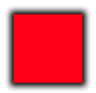
box-shadow: 0px 0px 10px 5px #000;
Shadow will fall right under, blur 10px and it will be 5px larger than the element.
box-shadow: 3px 3px 10px #000 inset;
Shadow is offset 3px right and 3px down. It is blurred 10px. Inset is selected which makes the shadow fall inside the element.

You may of course also use rgba, for setting the color. Using the alpha channel to set opacity:
box-shadow: 5px 5px 5px rgba(0, 0, 0, 0.6);
Shadow falls 5px right and 5px down. It will blur 5px and the color is black (0 ,0 ,0) with 0.6 opacity

Leave a Reply
You must be logged in to post a comment.